

A Nation United Under One Leaf
Rowing Canada Brand / DigitalHonouring the history of the sport and preparing the organization for the future.
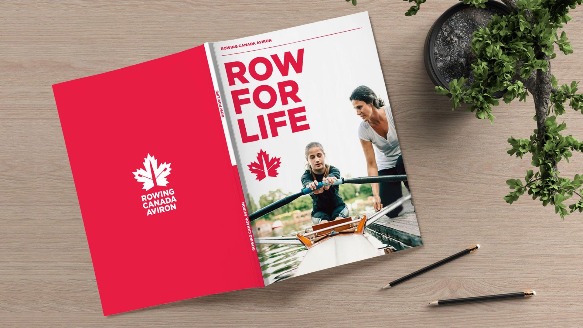
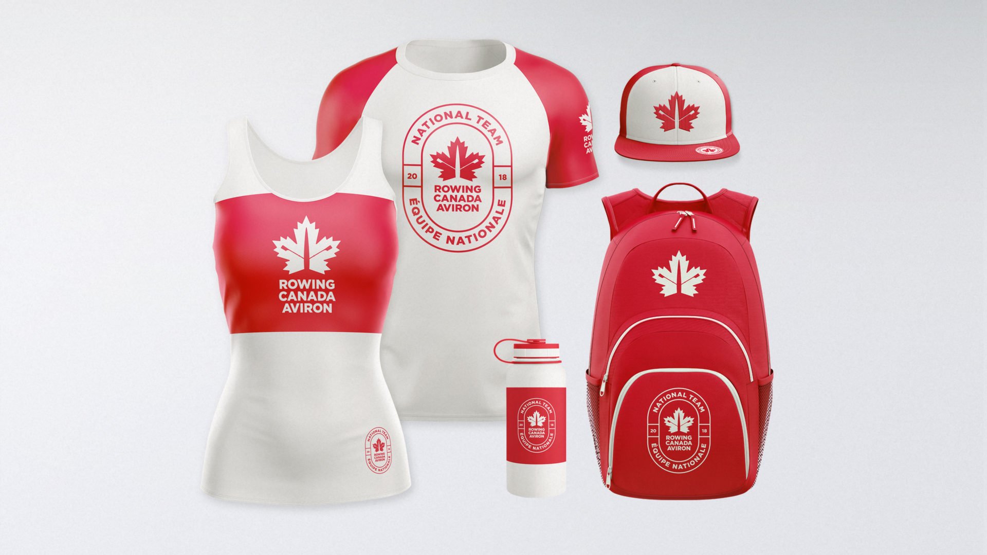
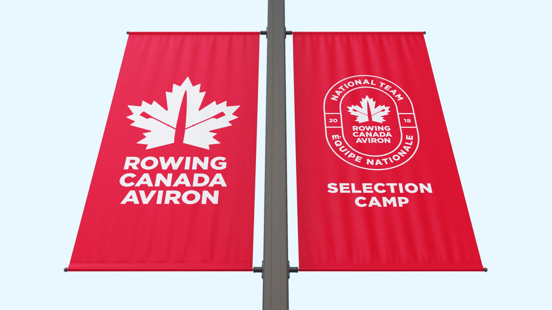
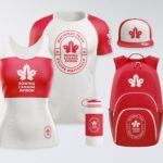
Since its inception in the late 1800s, Rowing Canada Aviron has always used the concept of oars and a Maple Leaf as part of its visual identity. The goal with the new brand identity was to pay respect to the history but develop something that will become the foundation for the future of the organization.
The new identity was designed to welcome more people into the sport, maintain Rowing Canada Aviron’s presence on the world stage and ensure the entire Canadian rowing community feels connected. This begins with a brand that is memorable and recognized at home and abroad.
