A brand built on collective wisdom.
Couchiching Ontario Health Team Brand / DigitalThe Couchiching Ontario Health Team (COHT) is a collection of dedicated community partners, passionate about co-designing an integrated healthcare continuum for our Community.

In 2019 the Provincial Government of Ontario introduced a new model of healthcare – Ontario Health Teams are designed to provide integrated care that will enable patients, families, communities, providers and system leaders to work together, innovate, and build on what is best in Ontario’s health care system.
The COHT team is nothing short of amazing. A dedicated, positive and passionate group that truly cares about what they are doing and acts more like a spirited group of entrepreneurs out to change the world – because they genuinely care about what they are creating.

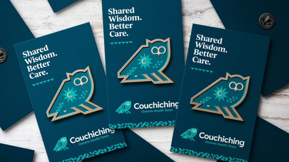
The brand for COHT needed to capture the essence of the group and resonate with members of the communities it serves while paying homage to the indigenous history of the region and its people.
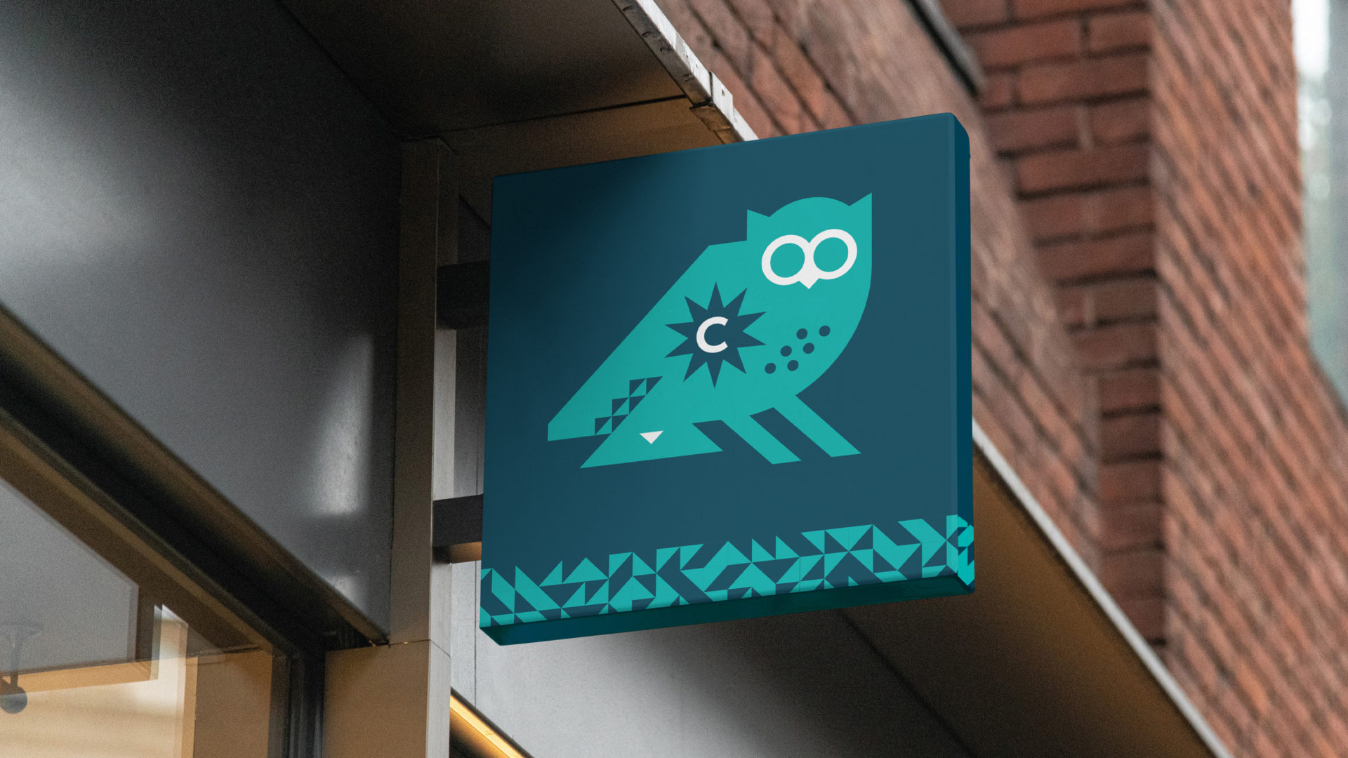
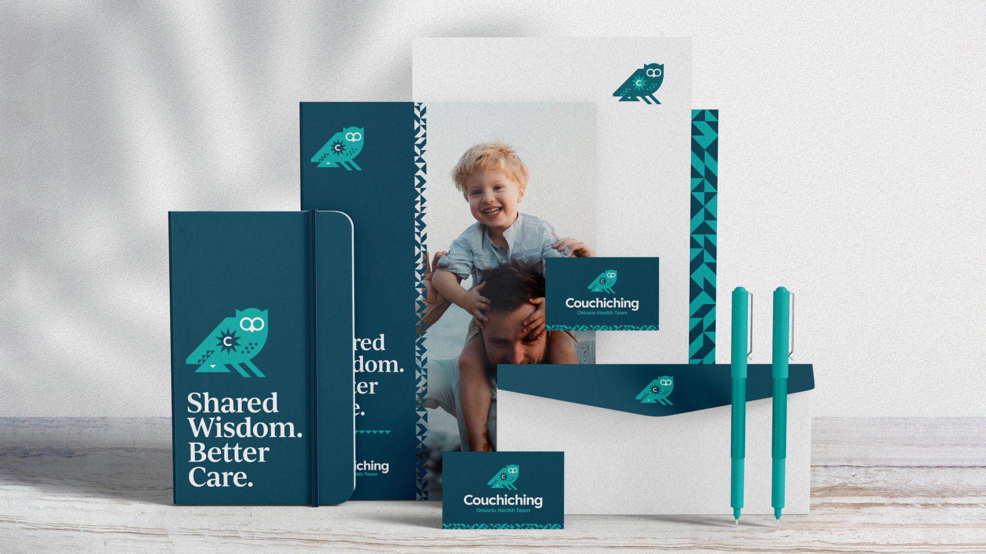
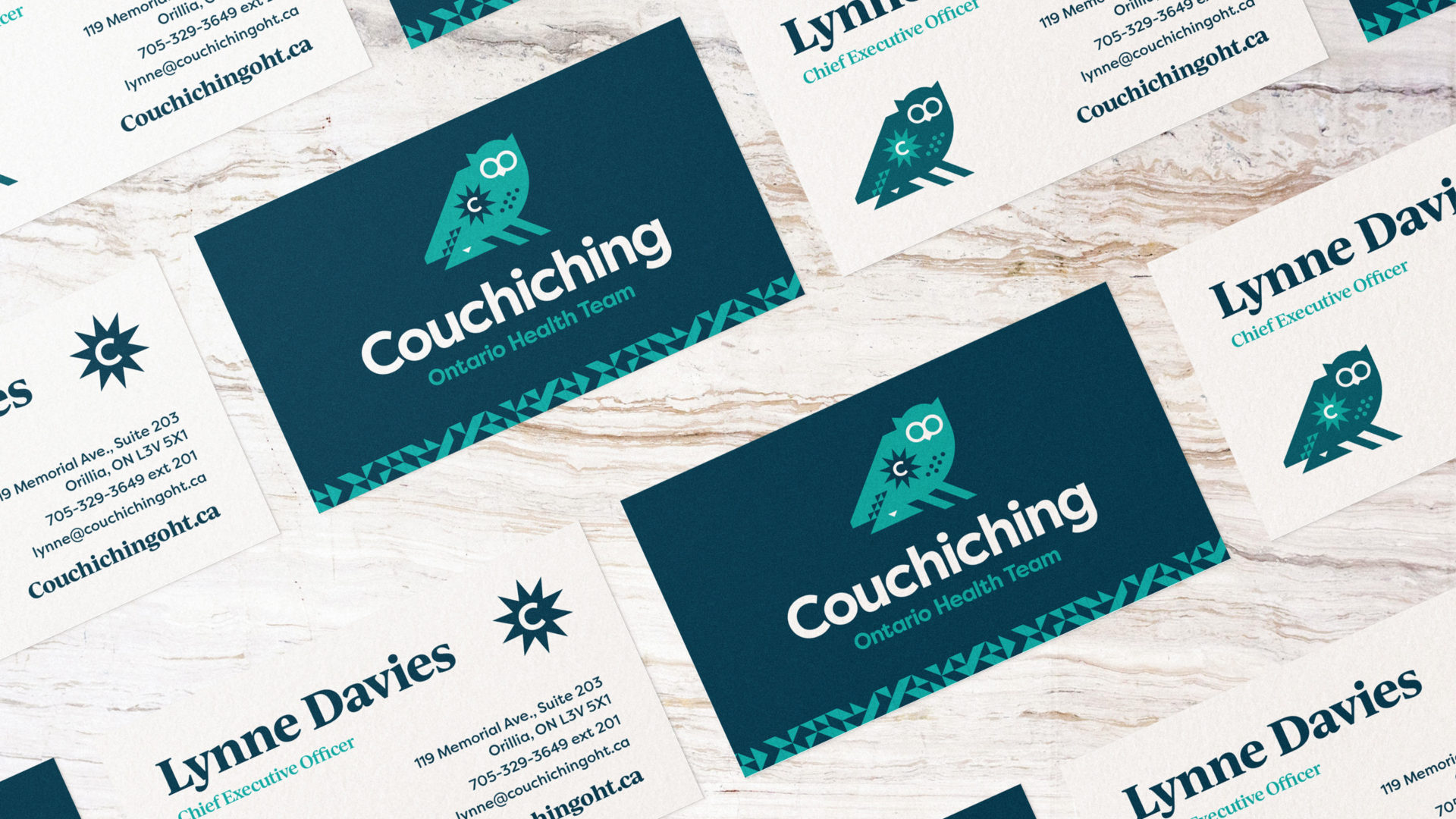
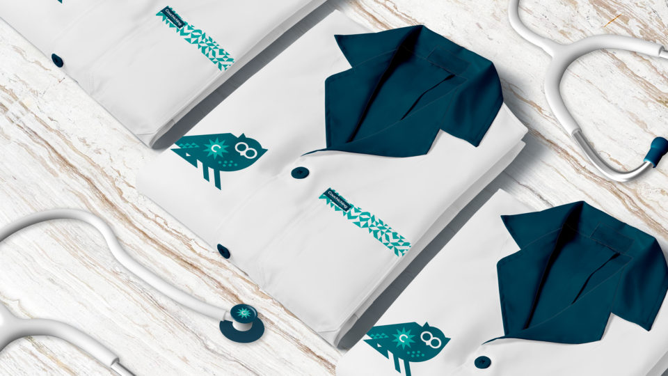
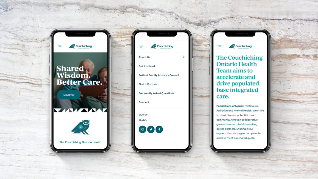
It needed to be instantly recognizable, friendly, inviting, welcoming and inclusive and speak to the core benefits, performing attributes and the spirit of the COHT group. The COHT Owl was created as the primary icon of the organization. The owl represents wisdom, intuition, supernatural power, independent thinking, and observant listening. While the sun was introduced to represent life, energy, positivity, clarity and confidence.